
While over half of the population prefers to shop online, there are some major roadblocks that stop ecommerce stores from making the sales they want.
For starters, consumers can’t touch, feel, or smell the product in all its glory through the veil of a pixelated screen.
This is why an enticing, compelling and, most importantly, visually descriptive product gallery is so important.
It is your one chance to impress customers with the quality of your products, otherwise they’ll hotfoot it over to your competitor’s site. On average, only 2.86% of ecommerce website visitors actually buy something, which means you have to pull all the stops out.
An optimized, shiny, and ultimately beautiful product gallery will boost both your traffic and conversions.
Here are some ways you can get creative while still making sure your product gallery attracts and converts customers.
1. UGC Product Galleries
90% of consumers say that UGC has a big impact on their purchasing decisions. This makes it a no-brainer to add UGC to your product galleries.
Additionally, studies show visitors stay on websites with UGC galleries 90% longer than those that don’t, and pages that include UGC have a 10% higher conversion rate.
Instead of using highly-edited photos with models and well-placed products, make your product gallery more authentic by incorporating user-generated images.
This helps give prospects a more realistic view of what they can expect when they purchase that same product.
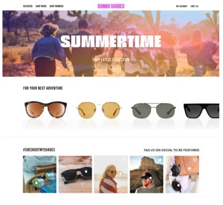
In this fictional example, the brand embeds their Instagram hashtag feed (which is populated with UGC) onto their homepage.
2. Add Social Proof
There’s a reason restaurateurs sit diners in the window – if a restaurant looks busy, it must be good. This is because we base our decisions on the actions of others, which explains the psychology behind social proof.
When transferred to the online world, social proof comes in the form of reviews, ratings, and testimonials.
Adding these elements to your product gallery adds that extra pull prospects might need to encourage them to buy.
Say, for example, you’re choosing between two similar products, but one has no customer ratings and the other has a five-star rating with 20 customer reviews.
Which one would you go for?
If your answer is the one with a five-star rating and tons of reviews, you’re not alone.
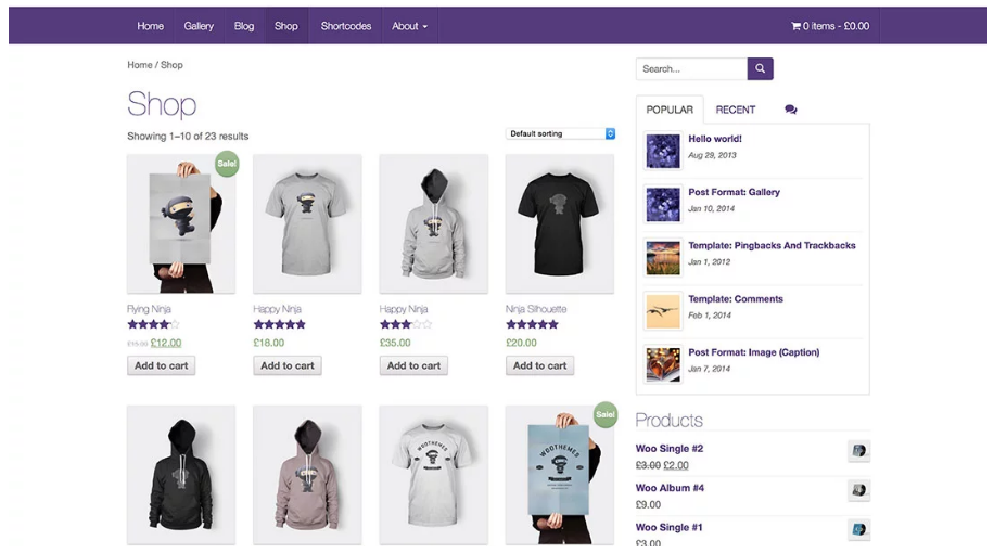
This example shows social proof in action – the images have a customer rating beneath them so future prospects can quickly see how popular each item is.
3. Be Bold With CTAs
The ultimate aim of your product gallery is to entice visitors to click through and buy a product. And, while most consumers know this is your goal, a gentle nudge in the right direction doesn’t hurt.
Show prospects where to click to find out more about a product in no uncertain terms or add in an eye-catching button beneath each photo that tells visitors what they need to do next.
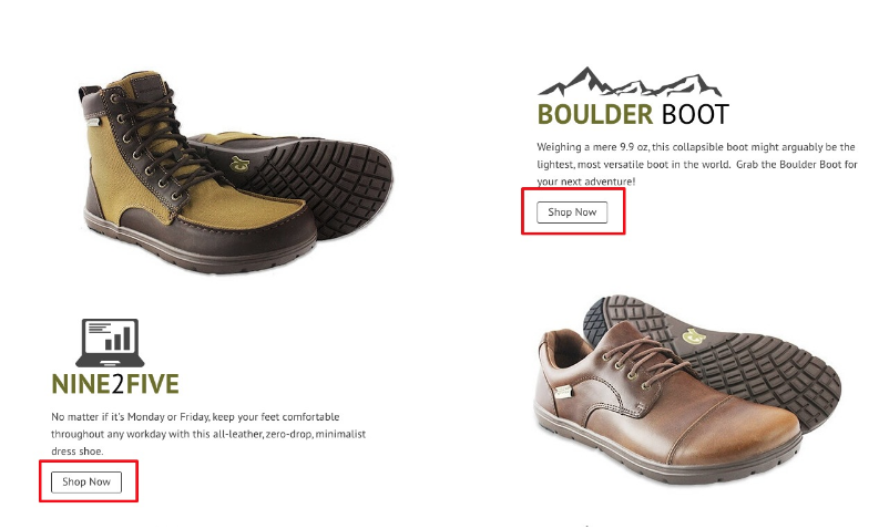
This example from Lems Shoes features stand-out “Shop Now” CTAs that leave visitors no doubt about what they should do next.
Need some top tips for making your CTAs shine? Here’s our take:
- Don’t add too many CTAs. Ideally you want to have a clear path for your customers to take, so avoid confusing them with multiple different actions
- Make sure your CTAs are relevant and make sense
- Don’t make your CTAs so eye-catching that they overshadow the product
- A/B test CTAs as much as you can to see which ones work best
With TINT, you can create a number of conversion-powered CTAs.
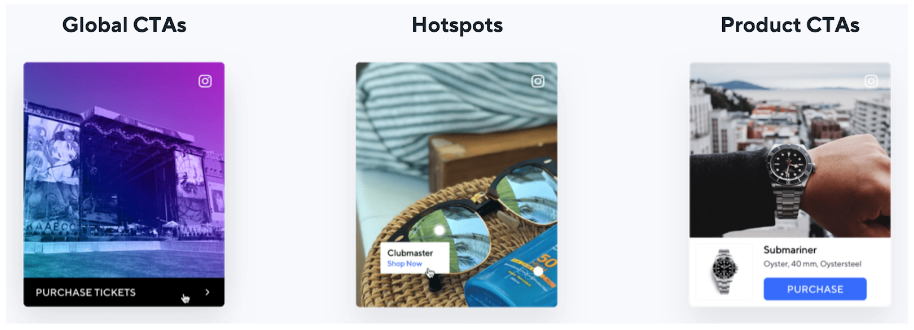
These include Hotspots, where you can tag multiple products with direct shoppable links and global CTAs, that let you add the same link to every photo in your gallery, and product CTAs that make your posts shoppable.
The Hotspots feature is particularly effective if you create mini-scenes within your product gallery or share UGC that shows off more than one of your products in a single image.
Visitors are able to tap on the image, see the different items that are involved, and click a shoppable link to take them directly to the product page of their chosen item.
4. Upsell and Cross-Sell Similar Products
If you’ve ever shopped on a big marketplace like Amazon, you’ve experienced upsell and cross-sell tactics.
This describes the process that happens when customers are recommended similar products or higher-ticket items based on their previous purchases.
It’s a form of personalization in the ecommerce world – and a pretty important one at that. 80% of shoppers are more likely to buy from a company that offers personalized experiences, like recommending relevant products.
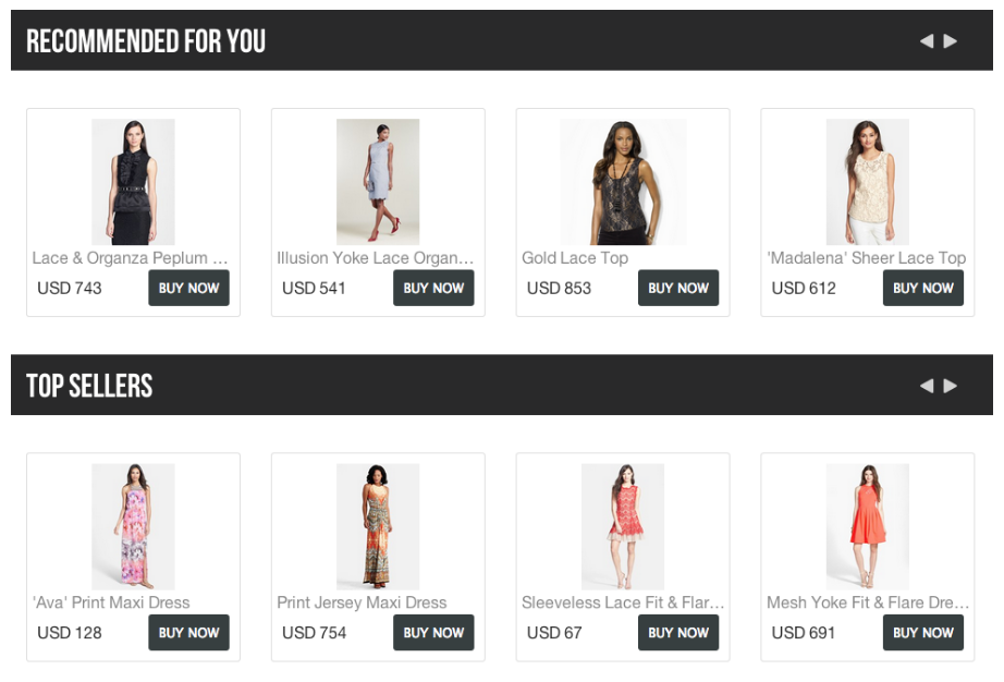
This example shares top items recommended for a specific customer as well as the top-sellers across the site.
5. 360 Degree Shots
Consumers can’t touch, smell, or feel what a product will be like in real life through the internet.
But you can help by making your product gallery as lifelike an experience as possible. You can do this by incorporating 360 degree images that give prospects an all-round picture of what to expect.
This not only engages customers (because they have to interact with the image), but it also serves to answer some of their key objections – like questions about size, what it looks like from the back, or how it may hang.
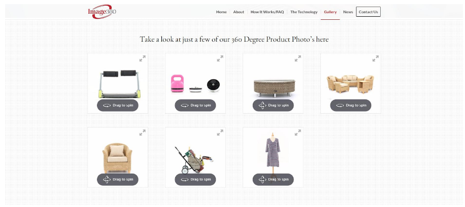
This example invites visitors to “drag to spin” each product in the gallery so they can get a better picture of what it will look like in real life.
6. Chat Option
When someone is in buying mode, they want to buy right now. If they can’t get want they want from your site, they’ll move on to a place where they can get the answers they need.
This means if you don’t quickly tackle all customer objections you may lose them.
To avoid this happening, you can incorporate a chat element into your product gallery – whether it’s a chatbot that is programmed to answer basic questions or a real human who’s on hand to help out in-the-moment.
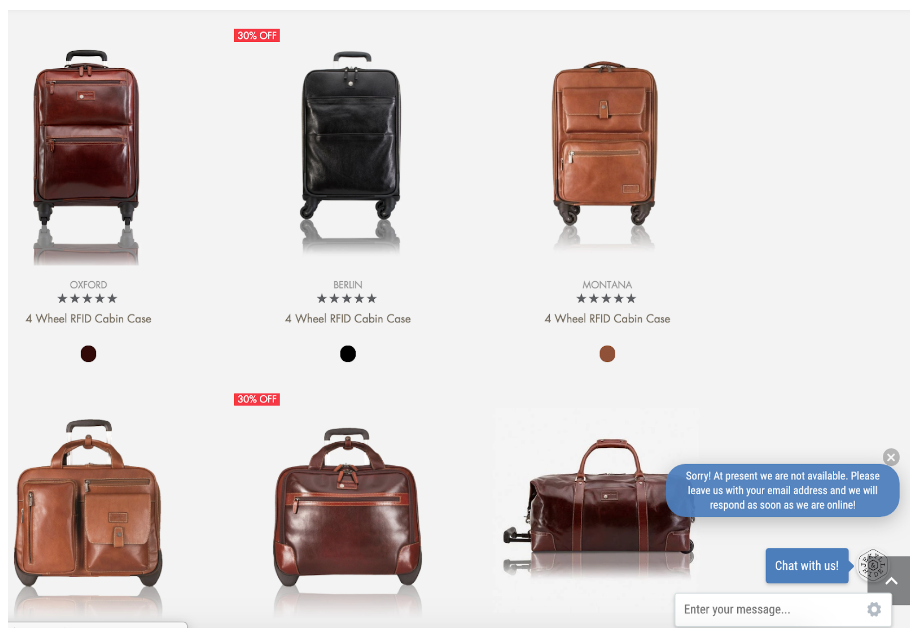
Jekyll and Hyde provide a chat option at the bottom of their product gallery so visitors can quickly get in touch.
7. Incorporate Video
Not only does video make it 53x more likely that you’ll get a front-page Google result, but consumers are 64% more likely to make a purchase after watching a video.
We spoke about adding 360 degree photos to your product gallery, but what about taking it one step further and incorporating video?
This helps solve the “can’t touch, can’t see” conundrum online shoppers face, but it also gives you the chance to show your product in action.
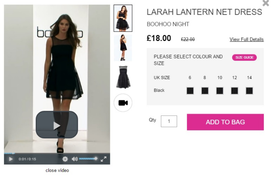
Boohoo regularly incorporates video into their product listings so that prospects can see the clothes in motion.
8. Powerful Visuals
This goes without saying.
Your product gallery should be as compelling and user-friendly as possible. Use murky images that make it difficult to see what you’re selling, and you’ll find your conversion rates will drastically plummet.
On the other hand, if you focus on sharing high-quality images (whether that’s imagery made by you or your customers), you’ll see an increase in conversions.
In fact, research analyzed data against nine million products found that images are the most important criteria that drive buying behavior.
The fact is, images matter.
As well as being beautiful and showing off your products in the best light, a powerful visual is also user friendly and drives a good customer experience.
Coupled with Hotspots and Product CTAs, these images reach customers who are in “buy mode” and are ready to go to the checkout.
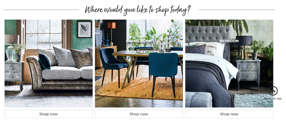
Barker and Stonehouse is a pro at using beautiful images in their product galleries to inspire prospects and encourage them to explore more.
Make Your Product Gallery Work Hard For You
There’s no doubt that your product gallery is one of the most important parts of your ecommerce store.
It’s where prospects can get a quick overview of the items you offer and can quickly see whether you’re a good fit for their needs.
Optimization doesn’t have to be a scary word – instead, just think of it as making the shopping experience better for your buyers. That means sharing beautiful images, highlighting social proof, make buying easy and upsell where you can.


